From Earth to Mind
Redesigning a Meal prep website and elevating sales
Client
From Earth to Mind LLC
Timeline
Role
UI /UX Design
8 weeks
Overview
Earth to Mind Meals is a small business focused on delivering wholesome, organic, ready-to-eat meals. With sustainability and wellness at its core, Earth to Mind sources fresh, locally-grown ingredients to craft meals that nurture both body and mind.
Problem
The current user experience on the website faces several issues that limit its effectiveness and user engagement. A primary concern is the complex navigation and lack of accessibility, which makes it challenging for users to explore meal options, customize orders, and complete the checkout process smoothly.
Project Goals
To address these issues, I focused on understanding the website's purpose and identifying ways to enhance its interface and user experience. By simplifying navigation and ensuring visual consistency, I made the user interface and experience intuitive. Iterative prototyping and client feedback helped refine the design.
Results & Insights
The redesign helped the increase in orders in the first week of launch. The solution successfully integrated a more intuitive navigation and information hierarchy throughout the design.

Methodologies
User Interviews
Survey insights
I wanted to gather more insights with quantitative research. I used social media platforms like Instagram and Discord to gather insights, selecting eight participants aged 24-45 from various demographic backgrounds. This approach allowed me to have a personal understanding of user preferences, motivations, and daily habits from users.
85% of users find convenience as a motivator to use meal prep service
80% of users engage in meal prepping to maintain a healthy lifestyle
75 % of users that order pre-made meals live in a 1-2 people household.
Affinity Map
Competitor analysis
I started my research by learning from the existing design. In talking with Earth to Mind owners, I found out that most of their clientele comes from referrals. Therefore they would like a design that would increase the number of new users and orders.
Relevant information was shared on who the target users are, busy professionals, remote workers, individuals focused on weight management, and fitness enthusiasts.
Using this information, I identified ideal participants for the study. Five participants were interviewed in person, each for 40-50 minutes, beginning with a brief introduction and followed by a structured interview. As it turns out users found the color palette to be overwhelming to the eyes. four of five users liked the menu selection but wished there was a wider selection of options. Another interesting fact was users placed convenience over price when it comes to their health.
Once I analyzed my research findings, some patterns stood out. Convenience was a common theme among the reasons users often use meal-delivery systems. Another common theme was health & nutrition as a motivator to engage is healthy eating. These observations were consistent with the survey results, which showed that 60% of users are fitness enthusiasts dedicated to consuming a higher protein intake.
After thoroughly researching market competitors like Factor75, Fuel Meal, and Hello Fresh, it was clear that From Earth to Mind's strengths, such as offering local pick-up, gave them an advantage in the market.
Factor75 and Fuel Meal do not offer pick-up locations for meals.
Factor Meals Limited dietary flexibility; no emphasis on organic
HelloFresh Not fully organic; requires cooking time
Research Synthesis
Persona

Creating this user persona, David, allowed me to design with the end user in mind. This persona helped focus the design on the needs and challenges of professionals, fitness enthusiasts using From Earth to Mind meal delivery service.
Empathy Map
I wanted to highlight potential areas for improvement by creating an empathy map that focuses on user needs. Using this resulting insights allowed for the refining of the existing design.
Task Flows
This part was the most challenging for me because I wanted to prioritize the user needs into actionable steps while ensuring each step aligned with their goals and expectations.
Sketches
The design journey started with brainstorming and sketching . These initial sketches served as the foundation for the design process, guiding me as I refined and shaped the ideas into cohesive and intuitive user experiences.
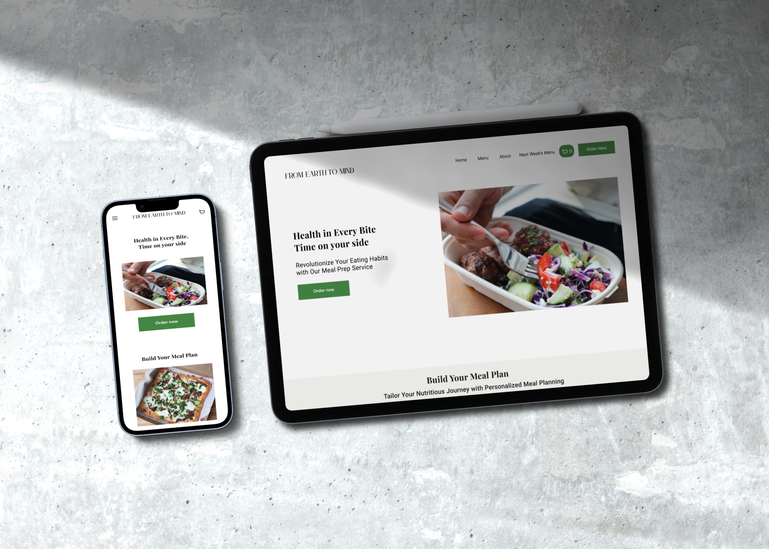
Landing page
Customize Meal
Low-Fidelity Wireframes
I translated selected sketches and user flow ideas into low-fidelity wireframes. This early stage helped visualize the app’s basic layout and structure, providing a foundation for further development.

Branding

In the Prototyping section, we transition from sketches to interactive mockups, bringing our designs to life in a tangible way. Here, we transform ideas into functional prototypes that simulate user interactions and workflows.
High-Fidelity Wireframes
This level of fidelity allowed me to conduct comprehensive user testing, gather meaningful feedback, and make final refinements before moving into the testing phase.
Prototype
Usability Testing
Five users participated by completing two tasks, adding a meal to their cart and customizing a meal. Each participant was given 15 minutes to perform both journeys with minimal assistant.
4 out of 5
1 out of 5
Design Iterations
These iterations were based on information from usability testing user feedback.
Before
After Iteration
After Iteration
Before
Following the current design and color palette that From Earth to Mind already had selected to enhance the overall design aesthetic.
The addition of background colors to specific sections serves to differentiate them effectively. Additionally, placing the cart icon on the navigation bar enhances user accessibility and promotes seamless navigation.
participants completed each task with zero difficulty
participants needed assistant customizing their meal
Reflection
Throughout the UI/UX project for the meal prep business, I encountered some real-life lessons through my challenges. Learning the ins and outs of Squarespace was intimidating at first but I was able to navigate and adjust to the constraints.
Also dealing with time constraints and finding users for interviews was tough. It made me realize the importance of being flexible and creative in my approach. It was a chance to sharpen management skills and prioritize tasks effectively.
I also discovered the importance of organizing information and ensuring the designs looked great on desktop and mobile. It was all about creating a seamless experience for the user.
In the end, this project wasn't just about technical skills for me; it was about learning to adapt and thrive in the face of challenges, and that's what made the process truly rewarding.
Next Steps
As I acquire new skills, I'm eager to revisit this projects and enhance it with the knowledge and experience I've gained. I understand the value of continuous learning and growth, especially in the context of designing for health and wellness. Moving forward, I'm excited to apply my expertise to create even more impactful and innovative designs in this space.