Discover a new way to homeschool with Serenity, the all-in-one app designed to make home education engaging, organized, and effective. Whether a seasoned homeschooler or just starting, Serenity offers a comprehensive suite of tools to support your educational journey.
Serenity
Role
UI/ UX Designer
Timeline
7 weeks
Year
2024
Personalized Approach
Education has undergone a significant transformation, with an increasing number of families opting for homeschooling as an alternative to traditional schooling.
The problem
Many homeschooling families struggle to effectively organize and manage their educational activities, leading to inefficiencies, disorganization, and frustration. Parents who are new to homeschooling often feel lost when gathering all the necessary tools to begin their journey.
Focusing On Goals
Industry
EdTech
Address the challenges faced by homeschooling parents
provide parents with a comprehensive digital solution that enhances organization, collaboration, and productivity.
create a platform for innovation and engagement
Discovery
The design process started with comprehensive research into market competitors, user interviews, and user personas. The process helped bring structure into the design process.
Comparing the market
Insights
First, I started on competitor analysis to identify a gap to tap into. I analyzed their platforms and features:

User Interviews
Five users were selected based on their demographics, focusing on work-from-home and stay-at-home parents. Candidates were chosen based on my familiarity with the homeschool community. Interviews lasted 40-60 minutes including a brief intro and questions.
90%
Of Parents use calendar apps to keep their schedules and their children’s schedules organized.
70%
Most parents find it overwhelming to have multiple of their children’s schedules mixed into one calendar.
60%
Use competitors like Google Calendar, iPhone Calendar, and Microsoft Excel.
80%
Use of various online platforms and apps for curriculum planning and tracking progress.
Insights
Ideas for design
Separate Calendar: allowing parents to keep their children’s calendar separate from their calendar would allow parents to not feel overwhelmed differentiating who is who.
Familiarity: following heuristics and design guides that parents are already familiar with would ease the transition of a secondary calendar.
Profiles: the use of customizable profile for each child would mitigate confusion on each child’s activities.
User Persona
Based on research gathered during interviews, a user persona was created. Designing for Angelica allowed me to stay on track with delivering a user experience that kept the user in mind.
Pain Points
Some of the struggles that Angelica and other users alike face are:
Struggles with juggling multiple subjects and activities for their children while also managing household responsibilities.
Parents find it challenging to stay organized and keep track of assignments and activities for each child while also keeping track of their own schedule and working full-time from home.
Parents Struggle with balancing the needs of multiple children with different learning levels and interests. They often feel overwhelmed with planning and coordinating activities for each child.
Research Synthesis
Empathy Map
Once I had synthesized all the information from interviews, the next step was to create an empathy map to understand users’ perspectives and experiences.
User Journey
To understand the user journey, I decided to break down the journey into key stages the user goes through.
Information architecture
Using prioritization I put together the information architecture to guide me through the next steps.
User Flow
To enhance user testing efficacy, I opted to develop task flows aimed at covering the user’s goals. This process helped me understand what the user journey would be like for the user
Add a lesson: This task flow was chosen because adding lessons is a fundamental aspect of homeschooling.
Access Child Profile: Homeschooling often involves teaching multiple children with different learning styles, preferences, and academic needs.
Add a New Student: Many homeschooling families may have more than one child, and some parents may decide to homeschool additional children over time.
Before taking low-fidelity into high fidelity I chose to lay out a style guide to help keep the design cohesive.
To establish the app's branding and overall feel, I applied color theory and selected a palette of pastel colors. These soft, soothing hues are ideal for an app where users spend significant time planning and organizing their schedules. The calming effect of pastels helps create a stress-free and inviting environment, promoting a positive user experience.
Branding
Ideation and Sketching
With all the data from the research synthesized, I was ready to move to ideation. I used brainstorming to come up with ideas and solutions.
These ideas were translated into paper and revised by my mentor.
Student Profile

Add Lesson

Low-Fidelity
Low-fidelity frames were created based on user task flows and initial sketches.


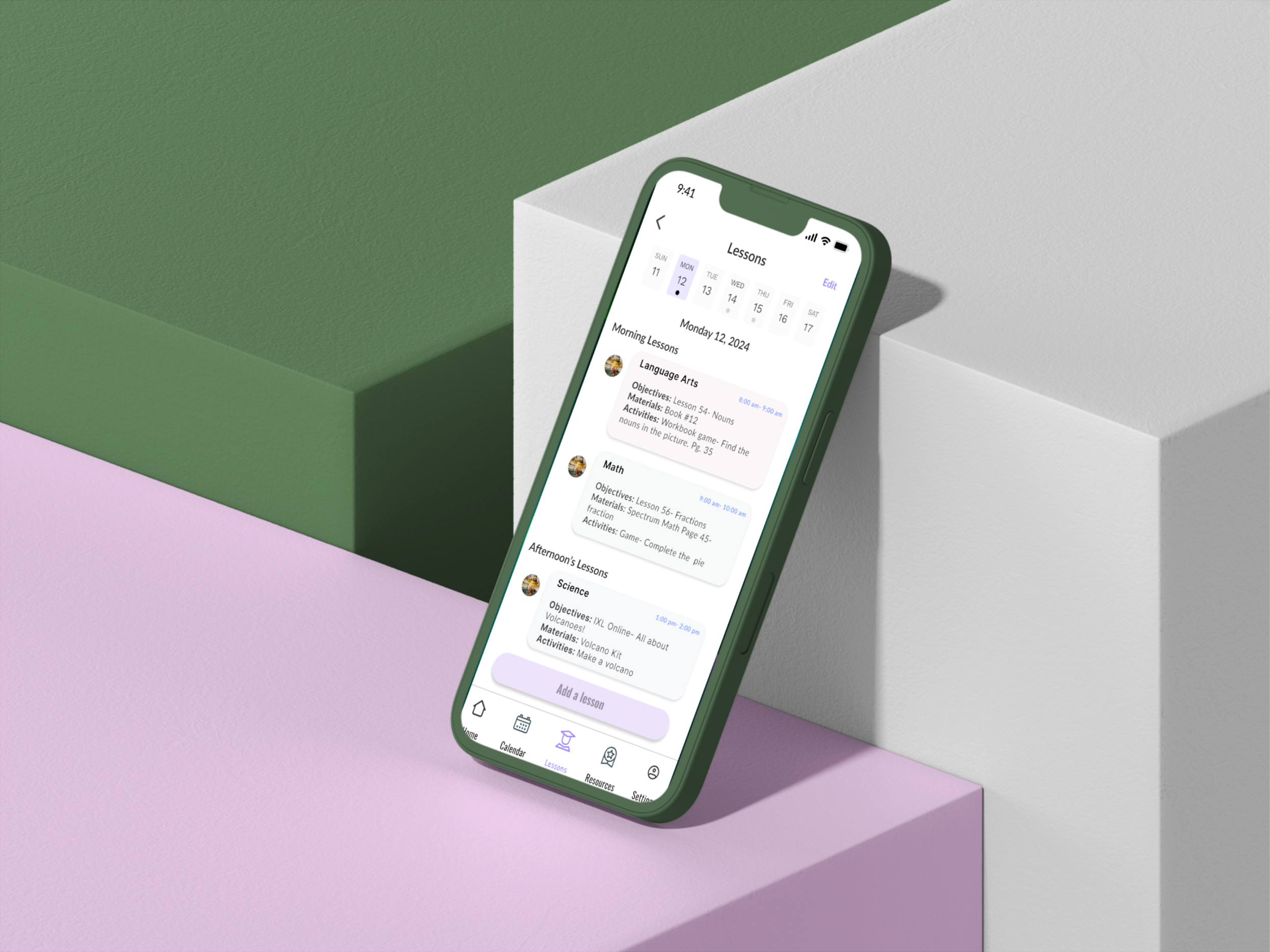
High-Fidelity Wireframes
The developed high-fidelity designs were based on low-fidelity sketches and data synthesis with the user in mind. I wanted to focus on a design that allows parents to use the calendar as a tool for everyday use.

Prototype
Testing was conducted with five participants, including a 1st-grade homeschool student. We focused on users adding lessons to their calendars and adding a student profile.
Usability Test Results
Testing was conducted with five participants, including a 1st-grade homeschool student. The outcome was a 100% success rate.
Customization Options: 4/5 users shared that the app was sufficient for their needs but suggested adding an exit button on the kid's profile.
Overall Satisfaction: 5/5 users rated their satisfaction with the app.
Customization Options: 2/5 users felt the customization options were sufficient for their homeschooling needs but suggested adding a “Due soon “ option.
Design Iterations
Feedback from usability testing was gathered and synthesize. Once I had all the information I made changes to the current design

Reflections
As I reflect on the journey of designing the homeschool calendar app, I look on the invaluable lessons learned and the growth experienced as a designer. Throughout the project, I encountered and effectively addressed challenges such as staying organized amidst the complexity of the design process and navigating the constraint of finding users available for interviews.
These experiences taught me resilience, adaptability, and the importance of creative problem-solving in overcoming obstacles. Achieving the goals set for this project, including implementing intuitive navigation, incorporating student access features, and ensuring clear labeling, has been immensely fulfilling.
Next Steps
The next steps involve further refining the app based on user insights, conducting additional usability testing, and exploring opportunities for expansion and enhancement. Overall, this project has been a rewarding journey of creativity, collaboration, and growth, and I am excited to apply these learnings to future design endeavors.